Wedding Week - Stationery
Hurrah for more wedding loveliness! Today I'm going to share all the stationery that I made (yes, MADE I tell you) with my own two hands - invitations, menus, escort cards, seating plans, and so on. Let's just say a lot of Pritt-Stick was involved, plus a plethora of paper cuts, and some fairly frequent cursing. It all turned out splendidly though, so totally worth the effort. My big tip for anyone who is bonkers enough to consider making their own wedding stationery is that everything takes about five times as long as you think it's going to, so get everything done well in advance in order to avoid ending up gluing confetti cones at 2am. Ahem.
My first task was to find the perfect paper. It had to be the right shade of ivory, the right weight, and the right texture. "Um, those samples all look the same," said my future husband. Poor man - the sample on the right was at least 20 gsm heavier than the one on the left. Men, eh. After much reasearch I ordered the ivory card and envelopes from a company called Daintree Paper (who I have just discovered are no longer trading), and bought the brown papers (plain and patterned) from Paperchase.
I went for a square centre-fold option, with two layered bands, plus ivory ribbon:
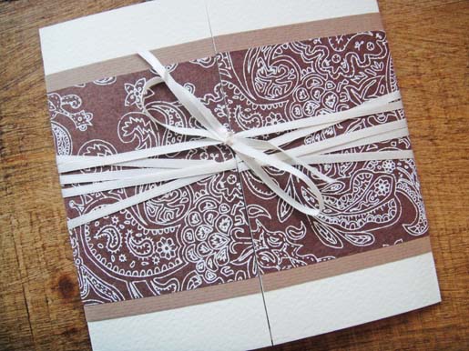
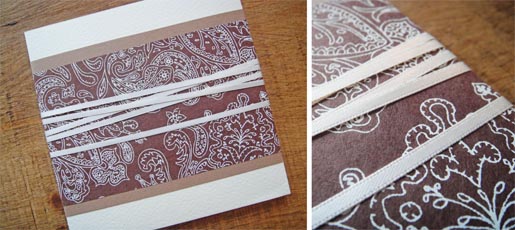
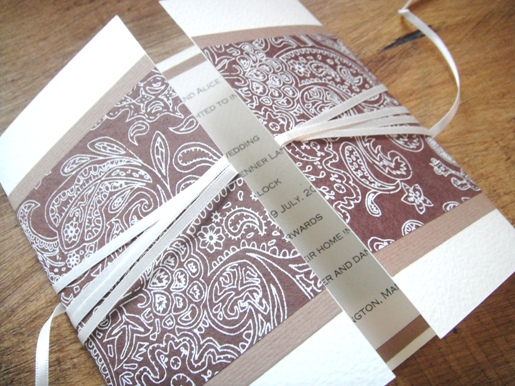
I also decided to draw a wedding map showing all the key locations (the church, our house, various Didsbury landmarks), which we enclosed with the invitations:
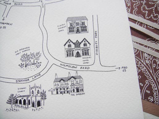
I created this map by driving to all the places, taking photos of them, doing a normal size drawing of them with black ink, scanning the picture in, shrinking it, and then using Photoshop to place each separate house onto a road map that I had also drawn separately and scanned in. This meant that I could have a lot of detail for each house, down to individual roof tiles, without trying to achieve this in a tiny drawing:
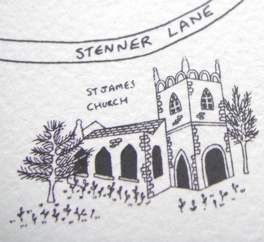
I then printed the maps onto the same paper as the invitations - and because I'd scanned the drawings at a high resolution, it preserved the actual pen marks (where I had coloured in the windows, for example) so each map came out looking as if it had been hand-drawn individually rather than printed.
I also made drink menus (which I fastened to wooden skewers and stuck into individual pots of herbs):

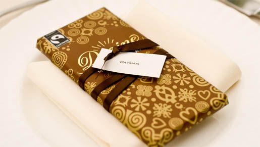
Name tags (fastened with ribbon onto bars of organic chocolate - and yes, Batman came to our wedding):
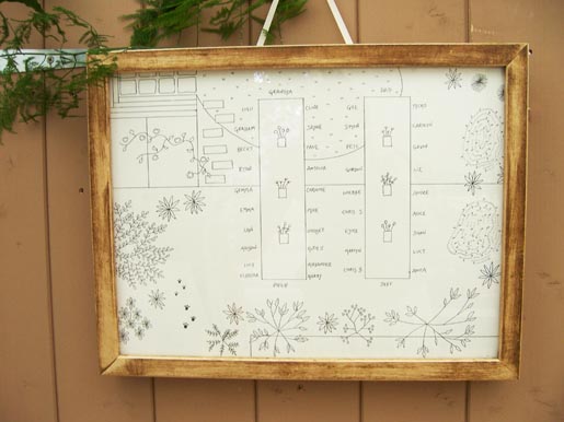
A table plan - an aerial drawing of our garden (we held the reception at home) which I placed in a wooden frame and hung from the door of the garden shed (yep, we were probably the only wedding in history for feature a garden shed as a prominent design element - more to come tomorrow!):
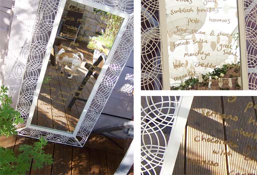
A menu - written in gold pen on an ivory-framed mirror:
And escort cards:
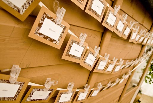
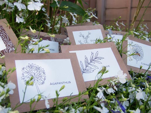
The idea behind these cards is that all our guests located their card by name - and on the back of the card found a picture of one of four flowers (agapanthus, olive, chrysanthemum and eucalyptus - all part of our wedding flowers) which corresponded to the order in which we wanted people to go up the Italian deli buffet table and pile their plates high. So the people with agapanthus cards were called first, followed by eucalyptus, and so on:

And then we went on our honeymoon and I slept for about 48 hours straight in sheer exhaustion from all that cutting and gluing.
Coming up tomorrow - decorating the marquee (and finding a team of Polish marquee providers who were prepared to put a marquee over our entire garden - suckers!)...