Finally, We Have Planning Permission!

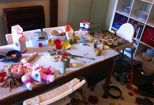
Around this time last year, I was asked by Dan Gibson, a very talented local RIBA architect, what we wanted to achieve as a result of building our house extension. "This!", I said, showing him the photo below. "I want to be saved from this!".
Those of you with nervous dispositions may wish to avert your gaze at this stage as you are about to witness the complete and total carnage created by two toddlers and two babies making gingerbread biscuits in a house where the kitchen is located in a bay window and the working triangle literally involves leaving the room.

Not shown - the eggs cracked onto the floor, the bag of flour emptied into the box of Lego, and the four children under four stuck to each other with golden syrup.
Many of us dream of an open-plan family living space with room to cook, eat, relax and watch the kids sharing their toys nicely. We wanted all these things, but also wanted to retain the quirky original features of the house (the ground floor is split-level, and one of the rooms on the right-hand side of the house has five walls, while the other has six), and we wanted it to be as affordable as possible, and therefore needed to minimise significant structural steel work.
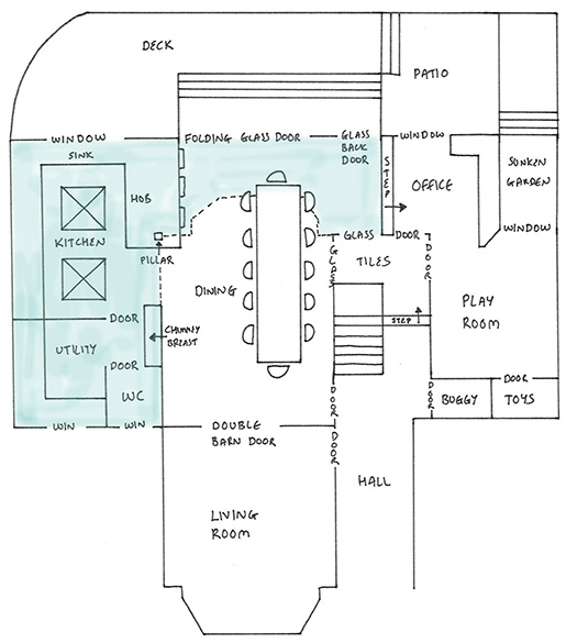
It's taken a year to get there, largely because I spent most of my time during those twelve months wiping golden syrup off the walls instead of concentrating on architecture, but here's my artist's impression of Dan's design, which has just been approved for planning permission. The blue shaded area shows the footprint of the extension.

Somehow, Dan has managed to squeeze in everything we wanted. A side-extension housing a U-shaped kitchen with a large peninsula for family baking sessions and enough space for our long-coveted two dishwashers. A secondary utility area (the main utility room is in the cellar) for recycling and storage. A downstairs WC. A dining table for twelve people. An office/family sofa area. A playroom. A room off the hall for storing buggies, scooters and coats. Storage for giant hideously coloured plastic toys. Lots of windows (but not too many - the garden is south-facing). A view straight through to the garden from the front door. Folding/sliding glass doors leading onto a raised deck area.

This is an older photo of the current playroom - this room will become the dining room, and bay window and wall up to the fireplace will be knocked through to the height of the picture rail to the new kitchen extension beyond. The kitchen peninsula will be sited where the floor lamp currently lives.
My favourite part of the design is the glass corner around the staircase. In order to meet UK building regulations, all staircases have to be enclosed by walls and doors - you can't have a staircase opening onto a large family area or kitchen the way you can in the US. So Dan came up with the ingenious idea of building a glass corner (to the right of the dining table in the drawing) around part of the staircase, and putting a glass door into the playroom (all with fire-safety glass) to give a view all the way across the ground floor from the kitchen peninsula to the playroom, while still retaining the separate rooms we'll need when the kids are older and want their own living space.
From the outside, the extension will be modern, built from white render. But it will be sited on a plinth of reclaimed bricks to link it back to the original house.

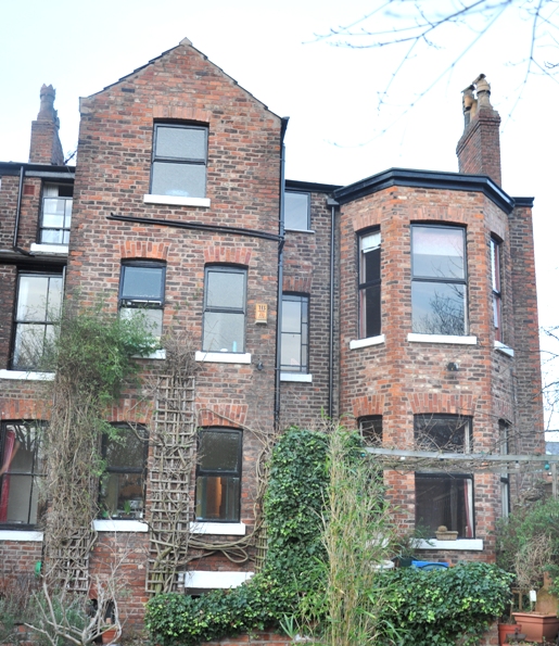
The bay window on the right will be replaced by the white rendered single-storey rear and side extension, which will join up with the existing tower bay window on the left.
And what's really clever about the design is that in terms of structural work, *all* we're doing is removing a bay window and part of a wall, which should keep the cost down significantly. I'd originally planned on knocking down all the walls around the office and playroom area (you can see my original drawing here), but apart from the fact that we can't do that as it would leave the staircase unprotected, it would probably more than double the cost.
So the next stage is to get the structural drawings done that builders can quote from. It's all extremely exciting. In the meantime, we're busy working away on the master bedroom, which has now reached the slightly terrifying back-to-brick stage where you find yourself wishing that you'd just left the wallpaper as it was.